20th October 2024 - Link Blog
You can use text-wrap: balance; on icons. Neat CSS experiment from Terence Eden: the new text-wrap: balance CSS property is intended to help make text like headlines display without ugly wrapped single orphan words, but Terence points out it can be used for icons too:
![]()
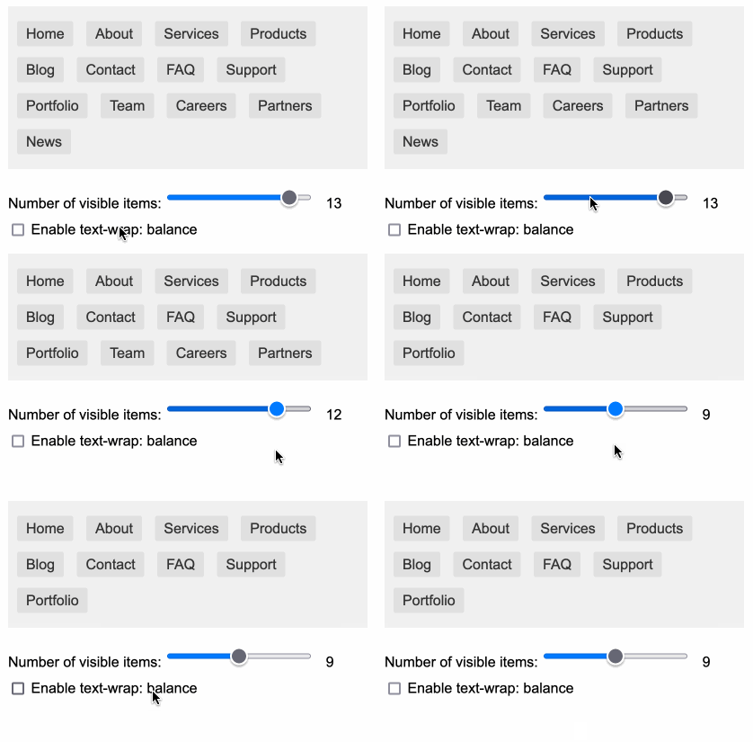
This inspired me to investigate if the same technique could work for text based navigation elements. I used Claude to build this interactive prototype of a navigation bar that uses text-wrap: balance against a list of display: inline menu list items. It seems to work well!

My first attempt used display: inline-block which worked in Safari but failed in Firefox.
Notable limitation from that MDN article:
Because counting characters and balancing them across multiple lines is computationally expensive, this value is only supported for blocks of text spanning a limited number of lines (six or less for Chromium and ten or less for Firefox)
So it's fine for these navigation concepts but isn't something you can use for body text.
Recent articles
- Experimenting with Starlette 1.0 with Claude skills - 22nd March 2026
- Profiling Hacker News users based on their comments - 21st March 2026
- Thoughts on OpenAI acquiring Astral and uv/ruff/ty - 19th March 2026