4 posts tagged “userexperience”
2024
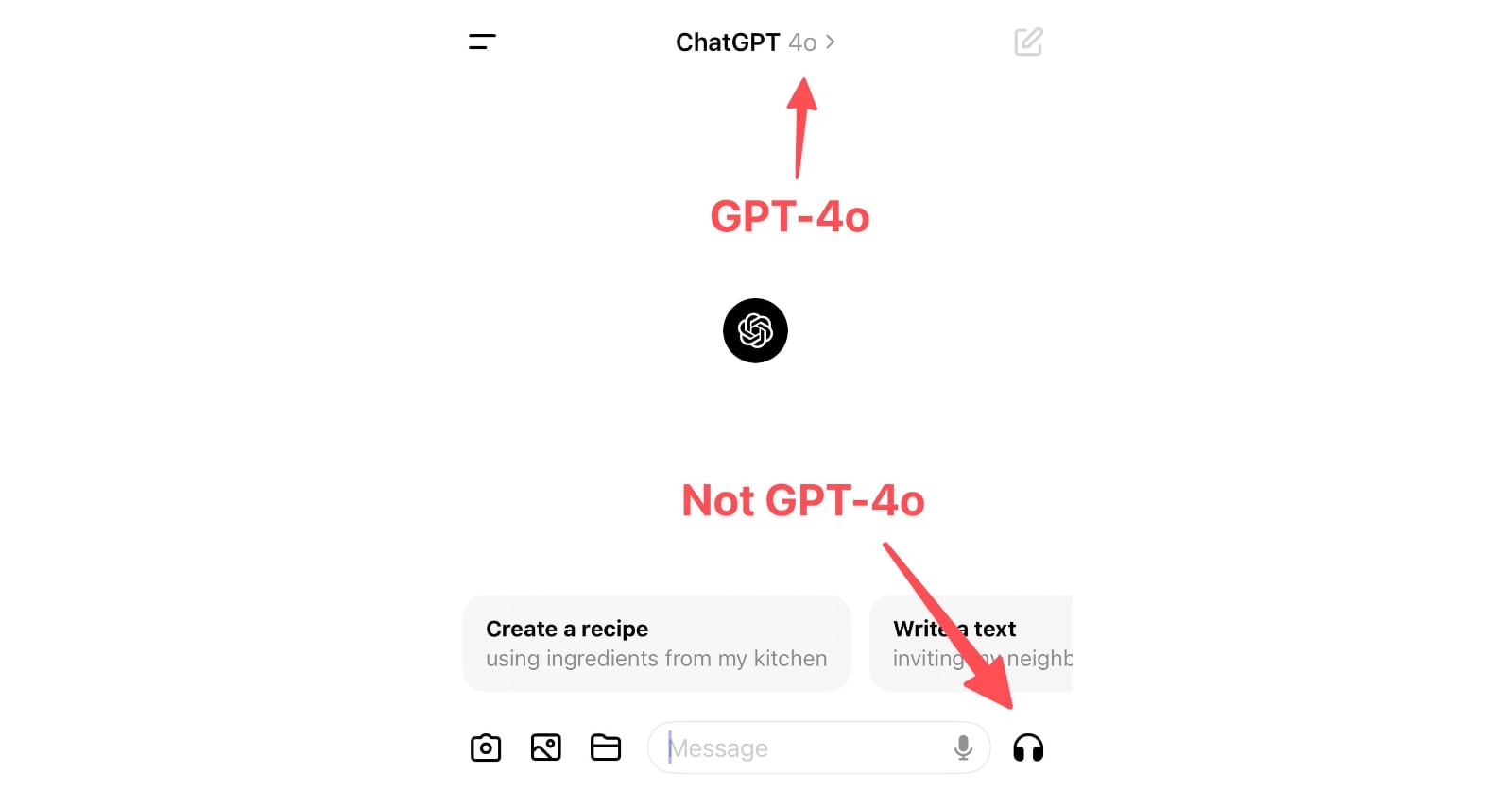
ChatGPT in “4o” mode is not running the new features yet
Monday’s OpenAI announcement of their new GPT-4o model included some intriguing new features:
[... 898 words]A bad survey won’t tell you it’s bad. It’s actually really hard to find out that a bad survey is bad — or to tell whether you have written a good or bad set of questions. Bad code will have bugs. A bad interface design will fail a usability test. It’s possible to tell whether you are having a bad user interview right away. Feedback from a bad survey can only come in the form of a second source of information contradicting your analysis of the survey results.
Most seductively, surveys yield responses that are easy to count and counting things feels so certain and objective and truthful.
Even if you are counting lies.
The language issues are indicative of the bigger problem facing the AI Pin, ChatGPT, and frankly, every other AI product out there: you can’t see how it works, so it’s impossible to figure out how to use it. [...] our phones are constant feedback machines — colored buttons telling us what to tap, instant activity every time we touch or pinch or scroll. You can see your options and what happens when you pick one. With AI, you don’t get any of that. Using the AI Pin feels like wishing on a star: you just close your eyes and hope for the best. Most of the time, nothing happens.
2010
Dark Patterns: Forced Continuity example, Audible.com. Dark Patterns are user interfaces that are designed to trick people. I just submitted Audible.com for their habit of signing up users for a $7.49 “gold membership” without making it clear on the checkout screens that this is a recurring monthly charge, not a one-off payment.
