Recreating the Apollo AI adoption rate chart with GPT-5, Python and Pyodide
9th September 2025
Apollo Global Management’s “Chief Economist” Dr. Torsten Sløk released this interesting chart which appears to show a slowdown in AI adoption rates among large (>250 employees) companies:
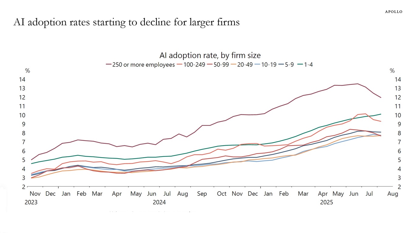
Here’s the full description that accompanied the chart:
The US Census Bureau conducts a biweekly survey of 1.2 million firms, and one question is whether a business has used AI tools such as machine learning, natural language processing, virtual agents or voice recognition to help produce goods or services in the past two weeks. Recent data by firm size shows that AI adoption has been declining among companies with more than 250 employees, see chart below.
(My first thought on seeing that chart is that I hope it represents the peak of inflated expectations leading into the trough of dissillusionment in the Gartner Hype Cycle (which Wikipedia calls “largely disputed, with studies pointing to it being inconsistently true at best”), since that means we might be reaching the end of the initial hype phase and heading towards the slope of enlightenment.)
Finding the US Census data with GPT-5 search
This is the first I’d heard of the US Census Bureau running a biweekly (that’s once every two weeks) survey about AI!
I decided to track down the numbers and see if I could recreate the chart myself. And since GPT-5 is really good at search now I fed it the following prompt to see how well it could do:
> The US Census Bureau conducts a biweekly survey of 1.2 million firms, and one question is whether a business has used AI tools such as machine learning, natural language processing, virtual agents or voice recognition to help produce goods or services in the past two weeks. Recent data by firm size shows that AI adoption has been declining among companies with more than 250 employees, see chart below.
Find me that original data
It took 1m19s to find exactly what I needed:
Here’s the original U.S. Census Bureau source for that series:
- BTOS “Employment size class” time series (XLSX) — biweekly shares of firms answering Yes to “In the last two weeks, did this business use Artificial Intelligence (AI) in producing goods or services?”, broken out by firm-size buckets (incl. 250+ employees). Coverage: Sep 11, 2023 → Aug 24, 2025. (Census.gov) [...]
That Census page was not at all obvious. Thankfully GPT-5 had tipped me off to the “Employment size class” file, this link here:
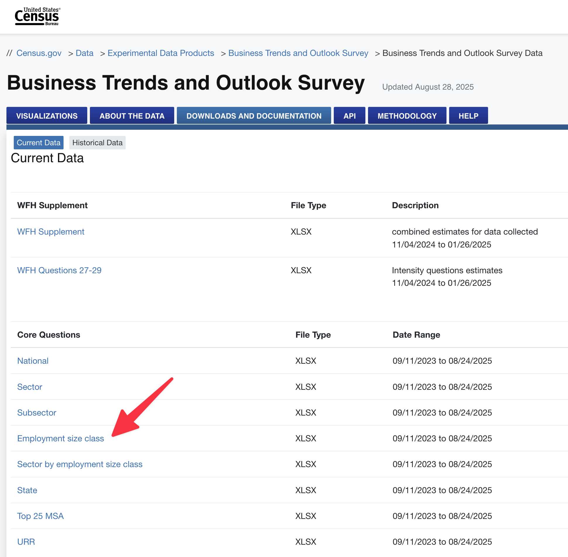
So I downloaded that file, and confirmed that it was indeed a spreadsheet containing the data I wanted (in among all sorts of other survey questions). Here’s a 374KB XLSX copy of the file I downloaded.
Recreating the chart with GPT-5 code interpreter
So what should I do with it now? I decided to see if GPT-5 could turn the spreadsheet back into that original chart, using Python running in its code interpreter tool.
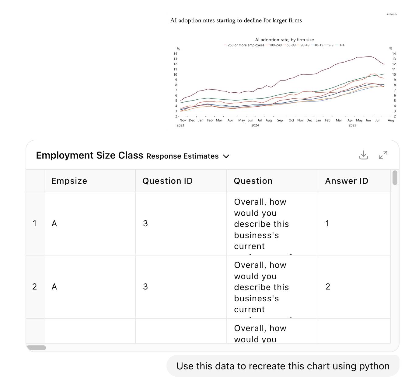
So I uploaded the XLSX file back to ChatGPT, dropped in a screenshot of the Apollo chart and prompted:
Use this data to recreate this chart using python
I thought this was a pretty tall order, but it’s always worth throwing big challenges at an LLM to learn from how well it does.
It really worked hard on this. I didn’t time it exactly but it spent at least 7 minutes “reasoning” across 5 different thinking blocks, interspersed with over a dozen Python analysis sessions. It used pandas and numpy to explore the uploaded spreadsheet and find the right figures, then tried several attempts at plotting with matplotlib.
As far as I can tell GPT-5 in ChatGPT can now feed charts it creates back into its own vision model, because it appeared to render a broken (empty) chart and then keep on trying to get it working.
It found a data dictionary in the last tab of the spreadsheet and used that to build a lookup table matching the letters A through G to the actual employee size buckets.
At the end of the process it spat out this chart:
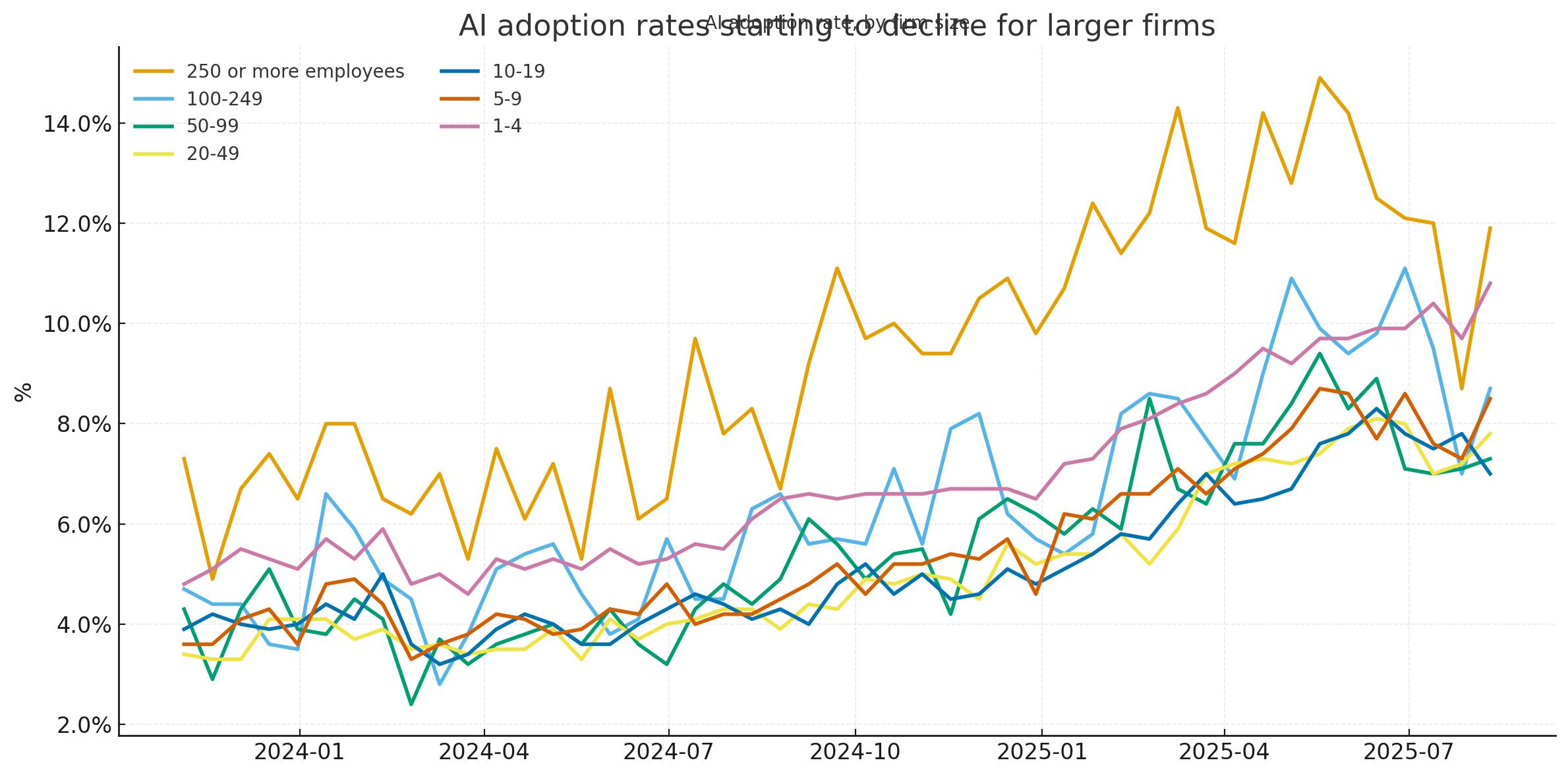
At first glance I thought it had nailed it... but then I compared the chart more closely with the Apollo original and spotted some definite discrepancies. GPT-5’s chart peaked at 14.5% but the highest value in Apollo’s was more like 13.5%. The GPT-5 chart was spikier—and most interestingly it included a clear uptick in the last data point where Apollo’s had trended downwards.
I decided it was time to look at the actual data. I opened up the spreadsheet in Numbers, found the AI question columns and manually reviewed them. They seemed to match the GPT-5 chart results—so why the difference to Apollo’s?
Then I noticed a crucial detail in the Apollo chart that I had cropped out of my original screenshot!
Note: Data is six-survey moving average.
So I told ChatGPT:
Do the first question, plot it as a six survey rolling average
I asked for the first question because it turned out there were two that were relevant in the survey spreadsheet.
- In the last two weeks, did this business use Artificial Intelligence (AI) in producing goods or services? (Examples of AI: machine learning, natural language processing, virtual agents, voice recognition, etc.)
- During the next six months, do you think this business will be using Artificial Intelligence (AI) in producing goods or services? (Examples of AI: machine learning, natural language processing, virtual agents, voice recognition, etc.)
It churned away for a little longer, added this code to the script:
# Compute 6-survey rolling average (biweekly cadence → ~12 weeks)
rolled = wide.rolling(window=6, min_periods=6).mean()
And popped out this chart (after I told it to fix the glitch in the title):
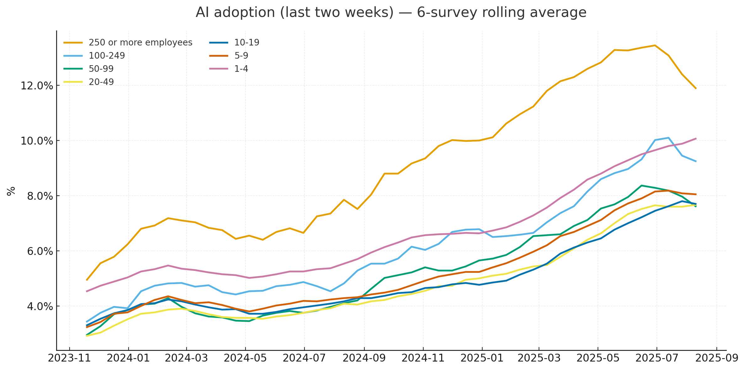
I think it’s done it! This is a very solid match for the Apollo original, recreated using matplotlib and pandas from the same underlying source data from the US Census.
Here’s the full Python code it wrote, which I think is quite readable (in as much as Pandas code can be):
import pandas as pd
import matplotlib.pyplot as plt
from matplotlib.ticker import PercentFormatter

path = "/mnt/data/Employment Size Class.xlsx"

resp = pd.read_excel(path, sheet_name="Response Estimates")
dates = pd.read_excel(path, sheet_name="Collection and Reference Dates")

is_current = resp["Question"].astype(str).str.strip().str.startswith("In the last two weeks")
ai_yes = resp[is_current & resp["Answer"].astype(str).str.strip().str.lower().eq("yes")].copy()

code_to_bucket = {"A":"1-4","B":"5-9","C":"10-19","D":"20-49","E":"50-99","F":"100-249","G":"250 or more employees"}
ai_yes["Bucket"] = ai_yes["Empsize"].map(code_to_bucket)

period_cols = [c for c in ai_yes.columns if str(c).isdigit() and len(str(c))==6]
long = ai_yes.melt(id_vars=["Bucket"], value_vars=period_cols, var_name="Smpdt", value_name="value")

dates["Smpdt"] = dates["Smpdt"].astype(str)
long["Smpdt"] = long["Smpdt"].astype(str)
merged = long.merge(dates[["Smpdt","Ref End"]], on="Smpdt", how="left")
merged["date"] = pd.to_datetime(merged["Ref End"], errors="coerce")

merged["value"] = pd.to_numeric(long["value"].astype(str).str.replace("%","",regex=False).str.strip(), errors="coerce")

order = ["250 or more employees","100-249","50-99","20-49","10-19","5-9","1-4"]
wide = merged.pivot_table(index="date", columns="Bucket", values="value", aggfunc="mean").sort_index()
wide = wide[[c for c in order if c in wide.columns]]
rolled = wide.rolling(window=6, min_periods=6).mean()

start, end = pd.Timestamp("2023-11-01"), pd.Timestamp("2025-08-31")
rolled_win = rolled.loc[(rolled.index >= start) & (rolled.index <= end)]

fig, ax = plt.subplots(figsize=(12, 6))
for col in order:
    if col in rolled_win.columns:
        ax.plot(rolled_win.index, rolled_win[col], label=col, linewidth=2)

ax.set_title("AI adoption (last two weeks) — 6‑survey rolling average", pad=16)
ax.yaxis.set_major_formatter(PercentFormatter(100))
ax.set_ylabel("%")
ax.set_xlabel("")
ax.grid(True, alpha=0.25, linestyle="--")
ax.legend(title=None, loc="upper left", ncols=2, frameon=False)
plt.tight_layout()

png_path = "/mnt/data/ai_adoption_rolling6_by_firm_size.png"
svg_path = "/mnt/data/ai_adoption_rolling6_by_firm_size.svg"
plt.savefig(png_path, dpi=200, bbox_inches="tight")
plt.savefig(svg_path, bbox_inches="tight")
I like how it generated an SVG version of the chart without me even asking for it.
You can access the ChatGPT transcript to see full details of everything it did.
Rendering that chart client-side using Pyodide
I had one more challenge to try out. Could I render that same chart entirely in the browser using Pyodide, which can execute both Pandas and Matplotlib?
I fired up a new ChatGPT GPT-5 session and prompted:
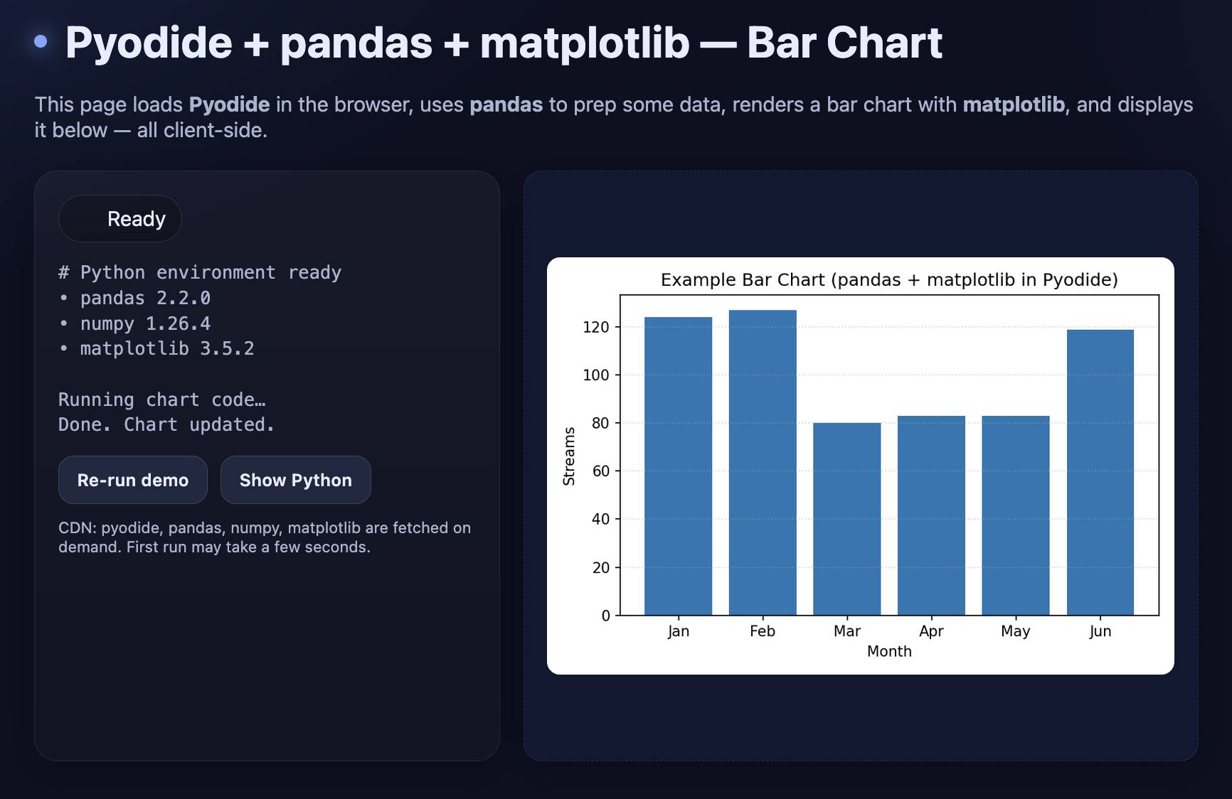
Build a canvas that loads Pyodide and uses it to render an example bar chart with pandas and matplotlib and then displays that on the page
My goal here was simply to see if I could get a proof of concept of a chart rendered, ideally using the Canvas feature of ChatGPT. Canvas is OpenAI’s version of Claude Artifacts, which lets the model write and then execute HTML and JavaScript directly in the ChatGPT interface.
It worked! Here’s the transcript and here’s what it built me, exported to my tools.simonwillison.net GitHub Pages site (source code here).
I’ve now proven to myself that I can render those Python charts directly in the browser. Next step: recreate the Apollo chart.
I knew it would need a way to load the spreadsheet that was CORS-enabled. I uploaded my copy to my /static/cors-allow/2025/... directory (configured in Cloudflare to serve CORS headers), pasted in the finished plotting code from earlier and told ChatGPT:
Now update it to have less explanatory text and a less exciting design (black on white is fine) and run the equivalent of this:(... pasted in Python code from earlier ...)
Load the XLSX sheet from https://static.simonwillison.net/static/cors-allow/2025/Employment-Size-Class-Sep-2025.xlsx
It didn’t quite work—I got an error about openpyxl which I manually researched the fix for and prompted:
Use await micropip.install("openpyxl") to install openpyxl - instead of using loadPackage
I had to paste in another error message:
zipfile.BadZipFile: File is not a zip file
Then one about a SyntaxError: unmatched ')' and a TypeError: Legend.__init__() got an unexpected keyword argument 'ncols'—copying and pasting error messages remains a frustrating but necessary part of the vibe-coding loop.
... but with those fixes in place, the resulting code worked! Visit tools.simonwillison.net/ai-adoption to see the final result:
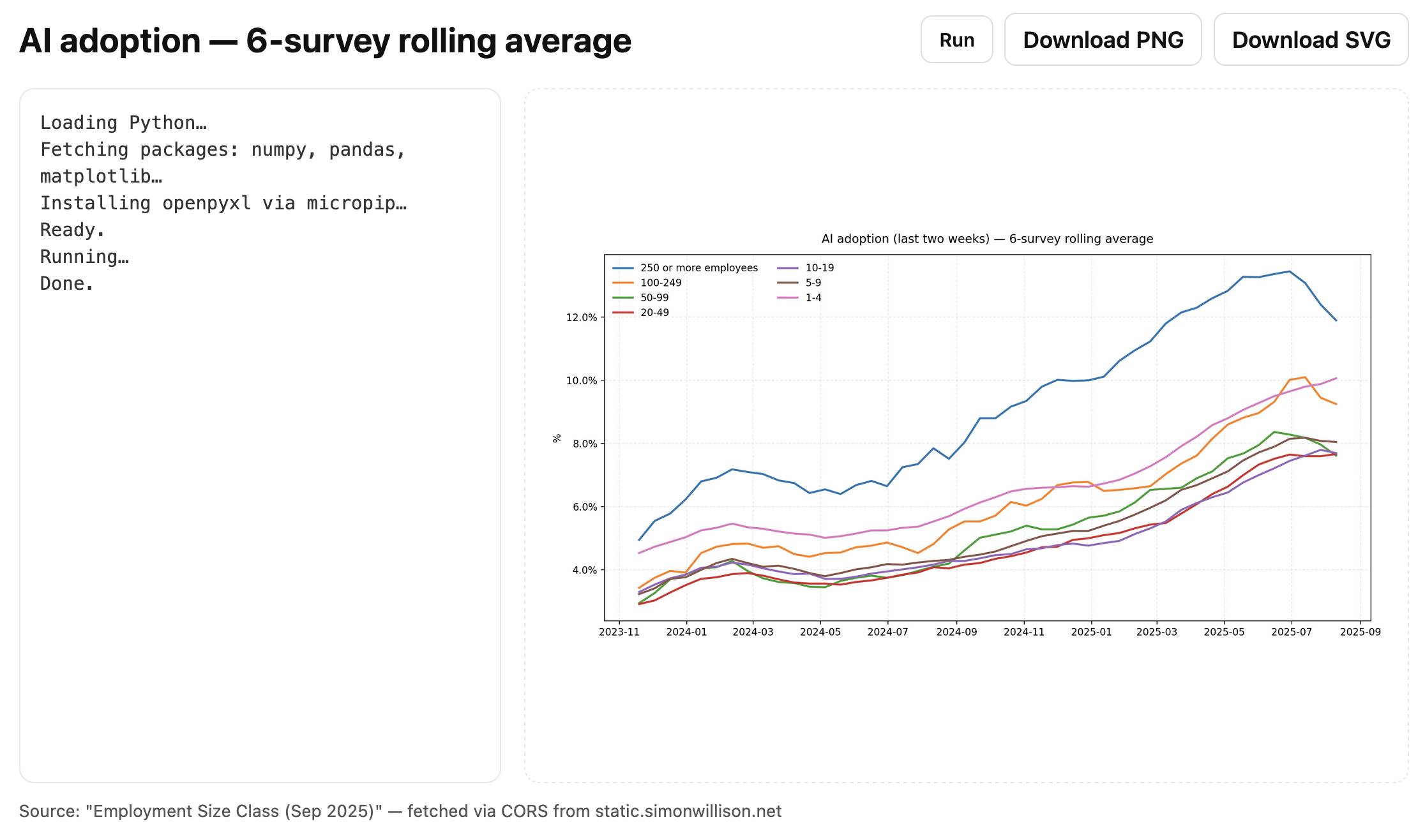
Here’s the code for that page, 170 lines all-in of HTML, CSS, JavaScript and Python.
What I’ve learned from this
This was another of those curiosity-inspired investigations that turned into a whole set of useful lessons.
- GPT-5 is great at tracking down US Census data, no matter how difficult their site is to understand if you don’t work with their data often
- It can do a very good job of turning data + a screenshot of a chart into a recreation of that chart using code interpreter, Pandas and matplotlib
- Running Python + matplotlib in a browser via Pyodide is very easy and only takes a few dozen lines of code
- Fetching an XLSX sheet into Pyodide is only a small extra step using
pyfetchandopenpyxl:import micropip await micropip.install("openpyxl") from pyodide.http import pyfetch resp_fetch = await pyfetch(URL) wb_bytes = await resp_fetch.bytes() xf = pd.ExcelFile(io.BytesIO(wb_bytes), engine='openpyxl')
- Another new-to-me pattern: you can render an image to the DOM from Pyodide code like this:
from js import document
document.getElementById('plot').src = 'data:image/png;base64,' + img_b64
I will most definitely be using these techniques again in future.
Update: Coincidentally Claude released their own upgraded equivalent to ChatGPT Code Interpreter later on the day that I published this story, so I ran the same chart recreation experiment against Claude Sonnet 4 to see how it compared.
More recent articles
- Mr. Chatterbox is a (weak) Victorian-era ethically trained model you can run on your own computer - 30th March 2026
- Vibe coding SwiftUI apps is a lot of fun - 27th March 2026
- Experimenting with Starlette 1.0 with Claude skills - 22nd March 2026