95 posts tagged “accessibility”
2025
Introducing ChatGPT Atlas (via) Last year OpenAI hired Chrome engineer Darin Fisher, which sparked speculation they might have their own browser in the pipeline. Today it arrived.
ChatGPT Atlas is a Mac-only web browser with a variety of ChatGPT-enabled features. You can bring up a chat panel next to a web page, which will automatically be populated with the context of that page.
The "browser memories" feature is particularly notable, described here:
If you turn on browser memories, ChatGPT will remember key details from your web browsing to improve chat responses and offer smarter suggestions—like retrieving a webpage you read a while ago. Browser memories are private to your account and under your control. You can view them all in settings, archive ones that are no longer relevant, and clear your browsing history to delete them.
Atlas also has an experimental "agent mode" where ChatGPT can take over navigating and interacting with the page for you, accompanied by a weird sparkle overlay effect:
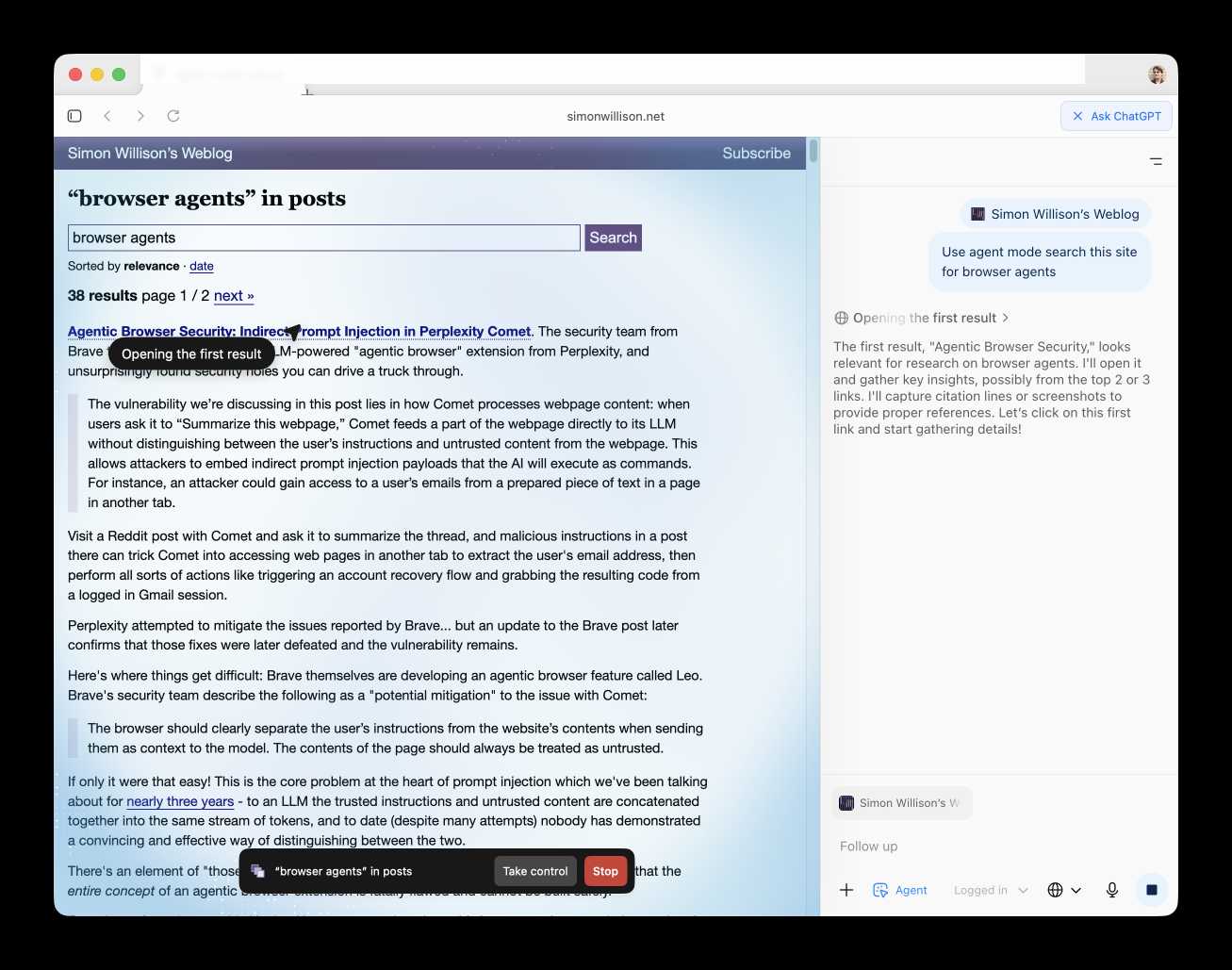
Here's how the help page describes that mode:
In agent mode, ChatGPT can complete end to end tasks for you like researching a meal plan, making a list of ingredients, and adding the groceries to a shopping cart ready for delivery. You're always in control: ChatGPT is trained to ask before taking many important actions, and you can pause, interrupt, or take over the browser at any time.
Agent mode runs also operates under boundaries:
- System access: Cannot run code in the browser, download files, or install extensions.
- Data access: Cannot access other apps on your computer or your file system, read or write ChatGPT memories, access saved passwords, or use autofill data.
- Browsing activity: Pages ChatGPT visits in agent mode are not added to your browsing history.
You can also choose to run agent in logged out mode, and ChatGPT won't use any pre-existing cookies and won't be logged into any of your online accounts without your specific approval.
These efforts don't eliminate every risk; users should still use caution and monitor ChatGPT activities when using agent mode.
I continue to find this entire category of browser agents deeply confusing.
The security and privacy risks involved here still feel insurmountably high to me - I certainly won't be trusting any of these products until a bunch of security researchers have given them a very thorough beating.
I'd like to see a deep explanation of the steps Atlas takes to avoid prompt injection attacks. Right now it looks like the main defense is expecting the user to carefully watch what agent mode is doing at all times!
Update: OpenAI's CISO Dane Stuckey provided exactly that the day after the launch.
I also find these products pretty unexciting to use. I tried out agent mode and it was like watching a first-time computer user painstakingly learn to use a mouse for the first time. I have yet to find my own use-cases for when this kind of interaction feels useful to me, though I'm not ruling that out.
There was one other detail in the announcement post that caught my eye:
Website owners can also add ARIA tags to improve how ChatGPT agent works for their websites in Atlas.
Which links to this:
ChatGPT Atlas uses ARIA tags---the same labels and roles that support screen readers---to interpret page structure and interactive elements. To improve compatibility, follow WAI-ARIA best practices by adding descriptive roles, labels, and states to interactive elements like buttons, menus, and forms. This helps ChatGPT recognize what each element does and interact with your site more accurately.
A neat reminder that AI "agents" share many of the characteristics of assistive technologies, and benefit from the same affordances.
The Atlas user-agent is Mozilla/5.0 (Macintosh; Intel Mac OS X 10_15_7) AppleWebKit/537.36 (KHTML, like Gecko) Chrome/141.0.0.0 Safari/537.36 - identical to the user-agent I get for the latest Google Chrome on macOS.
Should form labels be wrapped or separate? (via) James Edwards notes that wrapping a form input in a label event like this has a significant downside:
<label>Name <input type="text"></label>
It turns out both Dragon Naturally Speaking for Windows and Voice Control for macOS and iOS fail to understand this relationship!
You need to use the explicit <label for="element_id"> syntax to ensure those screen readers correctly understand the relationship between label and form field. You can still nest the input inside the label if you like:
<label for="idField">Name
  <input id="idField" type="text">
</label>
New dashboard: alt text for all my images. I got curious today about how I'd been using alt text for images on my blog, and realized that since I have Django SQL Dashboard running on this site and PostgreSQL is capable of parsing HTML with regular expressions I could probably find out using a SQL query.
I pasted my PostgreSQL schema into Claude and gave it a pretty long prompt:
Give this PostgreSQL schema I want a query that returns all of my images and their alt text. Images are sometimes stored as HTML image tags and other times stored in markdown.
blog_quotation.quotation,blog_note.bodyboth contain markdown.blog_blogmark.commentaryhas markdown ifuse_markdownis true or HTML otherwise.blog_entry.bodyis always HTMLWrite me a SQL query to extract all of my images and their alt tags using regular expressions. In HTML documents it should look for either
<img .* src="..." .* alt="..."or<img alt="..." .* src="..."(images may be self-closing XHTML style in some places). In Markdown they will always beI want the resulting table to have three columns: URL, alt_text, src - the URL column needs to be constructed as e.g.
/2025/Feb/2/slugfor a record where created is on 2nd feb 2025 and theslugcolumn containsslugUse CTEs and unions where appropriate
It almost got it right on the first go, and with a couple of follow-up prompts I had the query I wanted. I also added the option to search my alt text / image URLs, which has already helped me hunt down and fix a few old images on expired domain names. Here's a copy of the finished 100 line SQL query.
Notes from my Accessibility and Gen AI podcast appearance
I was a guest on the most recent episode of the Accessibility + Gen AI Podcast, hosted by Eamon McErlean and Joe Devon. We had a really fun, wide-ranging conversation about a host of different topics. I’ve extracted a few choice quotes from the transcript.
[... 947 words]Why are my live regions not working? (via) Useful article to help understand ARIA live regions. Short version: you can add a live region to your page like this:
<div id="notification" aria-live="assertive"></div>
Then any time you use JavaScript to modify the text content in that element it will be announced straight away by any screen readers - that's the "assertive" part. Using "polite" instead will cause the notification to be queued up for when the user is idle instead.
There are quite a few catches. Most notably, the contents of an aria-live region will usually NOT be spoken out loud when the page first loads, or when that element is added to the DOM. You need to ensure the element is available and not hidden before updating it for the effect to work reliably across different screen readers.
I got Claude Artifacts to help me build a demo for this, which is now available at tools.simonwillison.net/aria-live-regions. The demo includes instructions for turning VoiceOver on and off on both iOS and macOS to help try that out.
2024
Clay UI library (via) Fascinating project by Nic Barker, who describes Clay like this:
Clay is a flex-box style UI auto layout library in C, with declarative syntax and microsecond performance.
His intro video to the library is outstanding: I learned a ton about how UI layout works from this, and the animated visual explanations are clear, tasteful and really helped land the different concepts:
Clay is a C library delivered in a single ~2000 line clay.h dependency-free header file. It only handles layout calculations: if you want to render the result you need to add an additional rendering layer.
In a fascinating demo of the library, the Clay site itself is rendered using Clay C compiled to WebAssembly! You can even switch between the default HTML renderer and an alternative based on Canvas.
This isn't necessarily a great idea: because the layout is entirely handled using <div> elements positioned using transform: translate(0px, 70px) style CSS attempting to select text across multiple boxes behaves strangely, and it's not clear to me what the accessibility implications are.
Update: Matt Campbell:
The accessibility implications are as serious as you might guess. The links aren't properly labeled, there's no semantic markup such as headings, and since there's a div for every line, continuous reading with a screen reader is choppy, that is, it pauses at the end of every physical line.
It does make for a very compelling demo of what Clay is capable of though, especially when you resize your browser window and the page layout is recalculated in real-time via the Clay WebAssembly bridge.
You can hit "D" on the website and open up a custom Clay debugger showing the hierarchy of layout elements on the page:
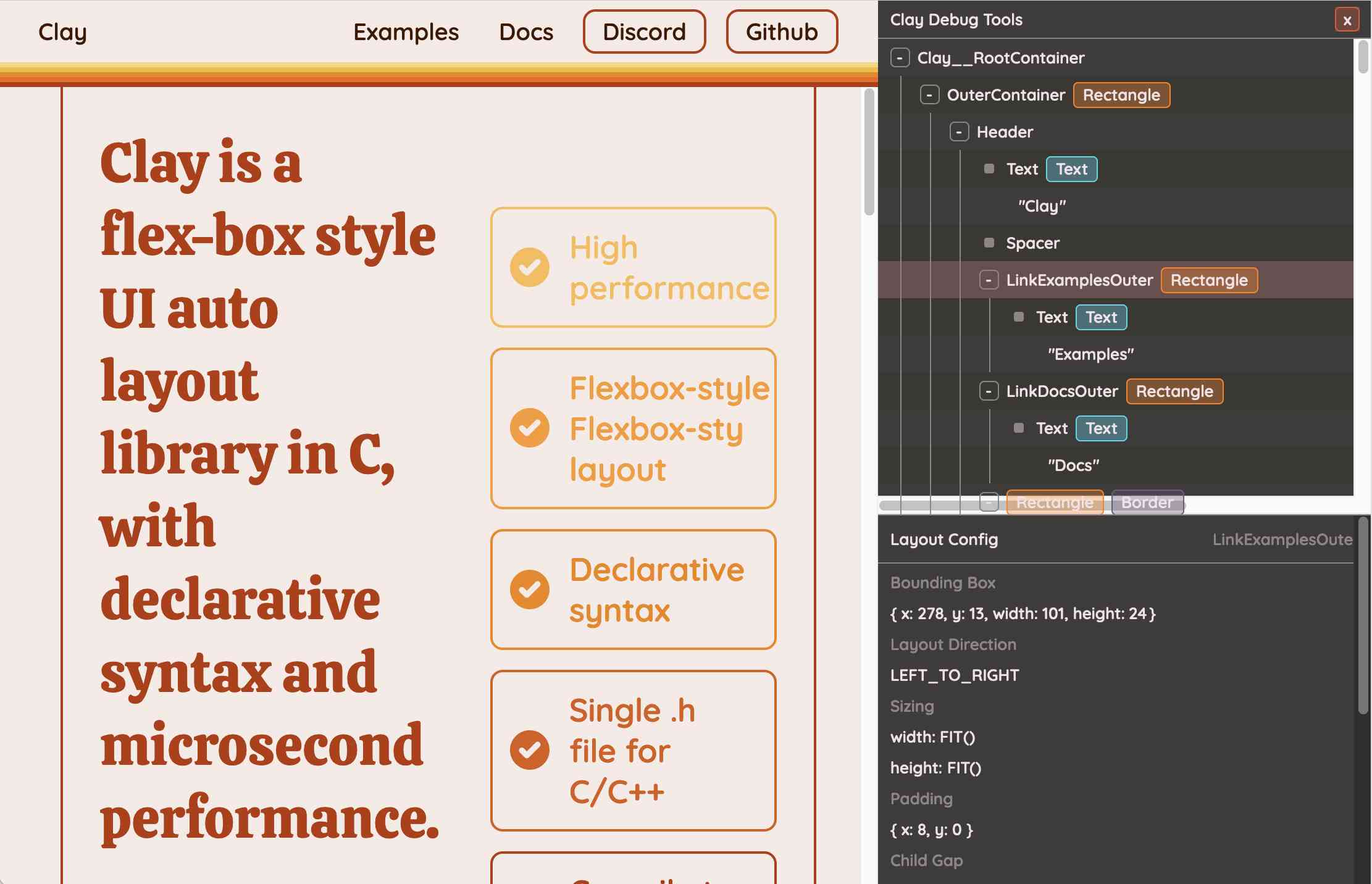
This also means that the entire page is defined using C code! Given that, I find the code itself surprisingly readable
void DeclarativeSyntaxPageDesktop() {
  CLAY(CLAY_ID("SyntaxPageDesktop"), CLAY_LAYOUT({ .sizing = { CLAY_SIZING_GROW(), CLAY_SIZING_FIT({ .min = windowHeight - 50 }) }, .childAlignment = {0, CLAY_ALIGN_Y_CENTER}, .padding = {.x = 50} })) {
    CLAY(CLAY_ID("SyntaxPage"), CLAY_LAYOUT({ .sizing = { CLAY_SIZING_GROW(), CLAY_SIZING_GROW() }, .childAlignment = { 0, CLAY_ALIGN_Y_CENTER }, .padding = { 32, 32 }, .childGap = 32 }), CLAY_BORDER({ .left = { 2, COLOR_RED }, .right = { 2, COLOR_RED } })) {
      CLAY(CLAY_ID("SyntaxPageLeftText"), CLAY_LAYOUT({ .sizing = { CLAY_SIZING_PERCENT(0.5) }, .layoutDirection = CLAY_TOP_TO_BOTTOM, .childGap = 8 })) {
        CLAY_TEXT(CLAY_STRING("Declarative Syntax"), CLAY_TEXT_CONFIG({ .fontSize = 52, .fontId = FONT_ID_TITLE_56, .textColor = COLOR_RED }));
        CLAY(CLAY_ID("SyntaxSpacer"), CLAY_LAYOUT({ .sizing = { CLAY_SIZING_GROW({ .max = 16 }) } })) {}
        CLAY_TEXT(CLAY_STRING("Flexible and readable declarative syntax with nested UI element hierarchies."), CLAY_TEXT_CONFIG({ .fontSize = 28, .fontId = FONT_ID_BODY_36, .textColor = COLOR_RED }));
        CLAY_TEXT(CLAY_STRING("Mix elements with standard C code like loops, conditionals and functions."), CLAY_TEXT_CONFIG({ .fontSize = 28, .fontId = FONT_ID_BODY_36, .textColor = COLOR_RED }));
        CLAY_TEXT(CLAY_STRING("Create your own library of re-usable components from UI primitives like text, images and rectangles."), CLAY_TEXT_CONFIG({ .fontSize = 28, .fontId = FONT_ID_BODY_36, .textColor = COLOR_RED }));
      }
      CLAY(CLAY_ID("SyntaxPageRightImage"), CLAY_LAYOUT({ .sizing = { CLAY_SIZING_PERCENT(0.50) }, .childAlignment = {.x = CLAY_ALIGN_X_CENTER} })) {
        CLAY(CLAY_ID("SyntaxPageRightImageInner"), CLAY_LAYOUT({ .sizing = { CLAY_SIZING_GROW({ .max = 568 }) } }), CLAY_IMAGE({ .sourceDimensions = {1136, 1194}, .sourceURL = CLAY_STRING("/clay/images/declarative.png") })) {}
      }
    }
  }
}
I'm not ready to ditch HTML and CSS for writing my web pages in C compiled to WebAssembly just yet, but as an exercise in understanding layout engines (and a potential tool for building non-web interfaces in the future) this is a really interesting project to dig into.
To clarify here: I don't think the web layout / WebAssembly thing is the key idea behind Clay at all - I think it's a neat demo of the library, but it's not what Clay is for. It's certainly an interesting way to provide a demo of a layout library!
Nic confirms:
You totally nailed it, the fact that you can compile to wasm and run in HTML stemmed entirely from a “wouldn’t it be cool if…” It was designed for my C projects first and foremost!
Themes from DjangoCon US 2024
I just arrived home from a trip to Durham, North Carolina for DjangoCon US 2024. I’ve already written about my talk where I announced a new plugin system for Django; here are my notes on some of the other themes that resonated with me during the conference.
[... 1,470 words]My @covidsewage bot now includes useful alt text. I've been running a @covidsewage Mastodon bot for a while now, posting daily screenshots (taken with shot-scraper) of the Santa Clara County COVID in wastewater dashboard.
Prior to today the screenshot was accompanied by the decidedly unhelpful alt text "Screenshot of the latest Covid charts".
I finally fixed that today, closing issue #2 more than two years after I first opened it.
The screenshot is of a Microsoft Power BI dashboard. I hoped I could scrape the key information out of it using JavaScript, but the weirdness of their DOM proved insurmountable.
Instead, I'm using GPT-4o - specifically, this Python code (run using a python -c block in the GitHub Actions YAML file):
import base64, openai
client = openai.OpenAI()
with open('/tmp/covid.png', 'rb') as image_file:
    encoded_image = base64.b64encode(image_file.read()).decode('utf-8')
messages = [
    {'role': 'system',
     'content': 'Return the concentration levels in the sewersheds - single paragraph, no markdown'},
    {'role': 'user', 'content': [
        {'type': 'image_url', 'image_url': {
            'url': 'data:image/png;base64,' + encoded_image
        }}
    ]}
]
completion = client.chat.completions.create(model='gpt-4o', messages=messages)
print(completion.choices[0].message.content)
I'm base64 encoding the screenshot and sending it with this system prompt:
Return the concentration levels in the sewersheds - single paragraph, no markdown
Given this input image:
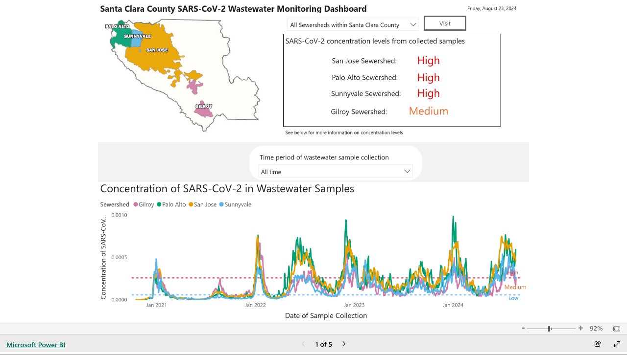
Here's the text that comes back:
The concentration levels of SARS-CoV-2 in the sewersheds from collected samples are as follows: San Jose Sewershed has a high concentration, Palo Alto Sewershed has a high concentration, Sunnyvale Sewershed has a high concentration, and Gilroy Sewershed has a medium concentration.
The full implementation can be found in the GitHub Actions workflow, which runs on a schedule at 7am Pacific time every day.
Reckoning. Alex Russell is a self-confessed Cassandra - doomed to speak truth that the wider Web industry stubbornly ignores. With this latest series of posts he is spitting fire.
The series is an "investigation into JavaScript-first frontend culture and how it broke US public services", in four parts.
In Part 2 — Object Lesson Alex profiles BenefitsCal, the California state portal for accessing SNAP food benefits (aka "food stamps"). On a 9Mbps connection, as can be expected in rural parts of California with populations most likely to need these services, the site takes 29.5 seconds to become usefully interactive, fetching more than 20MB of JavaScript (which isn't even correctly compressed) for a giant SPA that incoroprates React, Vue, the AWS JavaScript SDK, six user-agent parsing libraries and a whole lot more.
It doesn't have to be like this! GetCalFresh.org, the Code for America alternative to BenefitsCal, becomes interactive after 4 seconds. Despite not being the "official" site it has driven nearly half of all signups for California benefits.
The fundamental problem here is the Web industry's obsession with SPAs and JavaScript-first development - techniques that make sense for a tiny fraction of applications (Alex calls out document editors, chat and videoconferencing and maps, geospatial, and BI visualisations as apppropriate applications) but massively increase the cost and complexity for the vast majority of sites - especially sites primarily used on mobile and that shouldn't expect lengthy session times or multiple repeat visits.
There's so much great, quotable content in here. Don't miss out on the footnotes, like this one:
The JavaScript community's omertà regarding the consistent failure of frontend frameworks to deliver reasonable results at acceptable cost is likely to be remembered as one of the most shameful aspects of frontend's lost decade.
Had the risks been prominently signposted, dozens of teams I've worked with personally could have avoided months of painful remediation, and hundreds more sites I've traced could have avoided material revenue losses.
Too many engineering leaders have found their teams beached and unproductive for no reason other than the JavaScript community's dedication to a marketing-over-results ethos of toxic positivity.
In Part 4 — The Way Out Alex recommends the gov.uk Service Manual as a guide for building civic Web services that avoid these traps, thanks to the policy described in their Building a resilient frontend using progressive enhancement document.
Serving a billion web requests with boring code (via) Bill Mill provides a deep retrospective from his work helping build a relaunch of the medicare.gov/plan-compare site.
It's a fascinating case study of the choose boring technology mantra put into action. The "boring" choices here were PostgreSQL, Go and React, all three of which are so widely used and understood at this point that you're very unlikely to stumble into surprises with them.
Key goals for the site were accessibility, in terms of users, devices and performance. Despite best efforts:
The result fell prey after a few years to a common failure mode of react apps, and became quite heavy and loaded somewhat slowly.
I've seen this pattern myself many times over, and I'd love to understand why. React itself isn't a particularly large dependency but somehow it always seems to lead to architectural bloat over time. Maybe that's more of an SPA thing than something that's specific to React.
Loads of other interesting details in here. The ETL details - where brand new read-only RDS databases were spun up every morning after a four hour build process - are particularly notable.
Transcripts on Apple Podcasts (via) I missed this when it launched back in March: the Apple Podcasts app now features searchable transcripts, including the ability to tap on text and jump to that point in the audio.
Confusingly, you can only tap to navigate using the view of the transcript that comes up when you hit the quote mark icon during playback - if you click the Transcript link from the episode listing page you get a static transcript without the navigation option.
Transcripts are created automatically server-side by Apple, or podcast authors can upload their own edited transcript using Apple Podcasts Connect.
Experimenting with local alt text generation in Firefox Nightly (via) The PDF editor in Firefox (confession: I did not know Firefox ships with a PDF editor) is getting an experimental feature that can help suggest alt text for images for the human editor to then adapt and improve on.
This is a great application of AI, made all the more interesting here because Firefox will run a local model on-device for this, using a custom trained model they describe as "our 182M parameters model using a Distilled version of GPT-2 alongside a Vision Transformer (ViT) image encoder".
The model uses WebAssembly with ONNX running in Transfomers.js, and will be downloaded the first time the feature is put to use.
Cally: Accessibility statement (via) Cally is a neat new open source date (and date range) picker Web Component by Nick Williams.
It’s framework agnostic and weighs less than 9KB grilled, but the best feature is this detailed page of documentation covering its accessibility story, including how it was tested—in JAWS, NVDA and VoiceOver.
I’d love to see other open source JavaScript libraries follow this example.
Guidepup. I’ve been hoping to find something like this for years. Guidepup is “a screen reader driver for test automation”—you can use it to automate both VoiceOver on macOS and NVDA on Windows, and it can both drive the screen reader for automated tests and even produce a video at the end of the test.
Also available: @guidepup/playwright, providing integration with the Playwright browser automation testing framework.
I’d love to see open source JavaScript libraries both use something like this for their testing and publish videos of the tests to demonstrate how they work in these common screen readers.
2023
Ice Cubes GPT-4 prompts. The Ice Cubes open source Mastodon app recently grew a very good "describe this image" feature to help people add alt text to their images. I had a dig around in their repo and it turns out they're using GPT-4 Vision for this (and regular GPT-4 for other features), passing the image with this prompt:
What’s in this image? Be brief, it's for image alt description on a social network. Don't write in the first person.
New Default: Underlined Links for Improved Accessibility (GitHub Blog). “By default, links within text blocks on GitHub are now underlined. This ensures links are easily distinguishable from surrounding text.”
You can stop using user-scalable=no and maximum-scale=1 in viewport meta tags now. Luke Plant points out that your meta viewport tag should stick to just “width=device-width, initial-scale=1” these days—the user-scalable=no and maximum-scale=1 attributes are no longer necessary, and have a negative impact on accessibility, especially for Android users.
The anatomy of visually-hidden (via) James Edwards provides a detailed breakdown of the current recommended CSS for hiding content while keeping it available for assistive technologies in the browser accessibility and render trees. Lots of accumulated tricks and screen reader special cases in this.
2022
It looks like I’m moving to Mastodon
Elon Musk laid off about half of Twitter this morning. There are many terrible stories emerging about how this went down, but one that particularly struck me was that he laid off the entire accessibility team. For me this feels like a microcosm of the whole situation. Twitter’s priorities are no longer even remotely aligned with my own.
[... 1,546 words]WebAIM guide to using iOS VoiceOver to evaluate web accessibility (via) I asked for pointers on learning to use VoiceOver on my iPhone for accessibility testing today and Matt Hobbs pointed me to this tutorial from the WebAIM group at Utah State University.
Weeknotes: Distracted by Playwright
My goal for this week was to unblock progress on Datasette by finally finishing the dash encoding implementation I described last week. I was getting close, and then I got very distracted by Playwright.
[... 892 words]2021
A Complete Guide To Accessible Front-End Components. I’m so excited about this article: it brings together an absolute wealth of resources on accessible front-end components, including many existing component implementations that are accessible out of the box. Date pickers, autocomplete widgets, modals, menus—all sorts of things that I’ve been dragging my heels on implementing because I didn’t fully understand their accessibility implications.
2019
Using the HTML lang attribute (via) TIL the HTML lang attribute is used by screen readers to understand how to provide the correct accent and pronunciation.
2018
If you wrap your main content – that is, the stuff that isn’t navigation, logo and main header etc – in a
tag, a screen reader user can jump immediately to it using a keyboard shortcut. Imagine how useful that is – they don’t have to listen to all the content before it, or tab through it to get to the main meat of your page.
2017
How technology helped a blind athlete run free at the New York Marathon. Fascinating piece on technology to help blind people better navigate the world—combing GPS and chest-mounted ultrasonic sonar.
Skip the title text! Nobody uses them – they don’t work on touch screens and on desktop they require that the user hovers for a while over an image, which nobody does. Also, adding a title-text makes some screen readers both read the title-text and the alt-text, which becomes redundant.
Alt-texts: The Ultimate Guide. By Daniel Göransson, a web developer with vision impairment who uses a screen reader. This is the best, most practical guide to writing image alt text I’ve seen. Just one of the neat tips contained within: consider ending your alt text in a period, so the screen user knows to pause.
2010
My First Week with the iPhone. A blind user describes the experience of using VoiceOver on the iPhone, including the joy of discovering the Color Identifier app which speaks the names of colours picked up by the iPhone’s camera. “ I used color cues to find my pumpkin plants, by looking for the green among the brown and stone. I spent ten minutes looking at my pumpkin plants, with their leaves of green and lemon-ginger.”
2009
Accessibility and Degradation in Cappuccino. Ross Boucher from 280 North responds to Drew McLellan.
The Cost of Accessibility. Drew McLellan comments on the seemingly inevitable march towards JavaScript dependent applications, and argues that JavaScript frameworks such as Cappuccino have a duty to integrate accessibility in to their core.

