28 posts tagged “ux”
2025
Confession: we've been hiding parts of v0's responses from users since September. Since the launch of DeepSeek's web experience and its positive reception, we realize now that was a mistake. From now on, we're also showing v0's full output in every response. This is a much better UX because it feels faster and it teaches end users how to prompt more effectively.
— Jared Palmer, VP of AI at Vercel
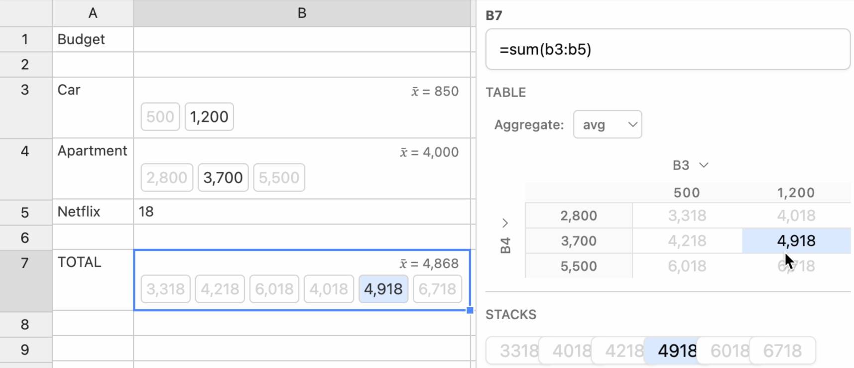
Ambsheets: Spreadsheets for exploring scenarios (via) Delightful UI experiment by Alex Warth and Geoffrey Litt at Ink & Switch, exploring the idea of a spreadsheet with cells that can handle multiple values at once, which they call "amb" (for "ambiguous") values. A single sheet can then be used to model multiple scenarios.
Here the cell for "Car" contains {500, 1200} and the cell for "Apartment" contains {2800, 3700, 5500}, resulting in a "Total" cell with six different values. Hovering over a calculated highlights its source values and a side panel shows a table of calculated results against those different combinations.

Always interesting to see neat ideas like this presented on top of UIs that haven't had a significant upgrade in a very long time.
2024
Mapping the landscape of gen-AI product user experience. Matt Webb attempts to map out the different user experience approaches to building on top of generative AI. I like the way he categorizes these potential experiences:
- Tools. Users control AI to generate something.
- Copilots. The AI works alongside the user in an app in multiple ways.
- Agents. The AI has some autonomy over how it approaches a task.
- Chat. The user talks to the AI as a peer in real-time.
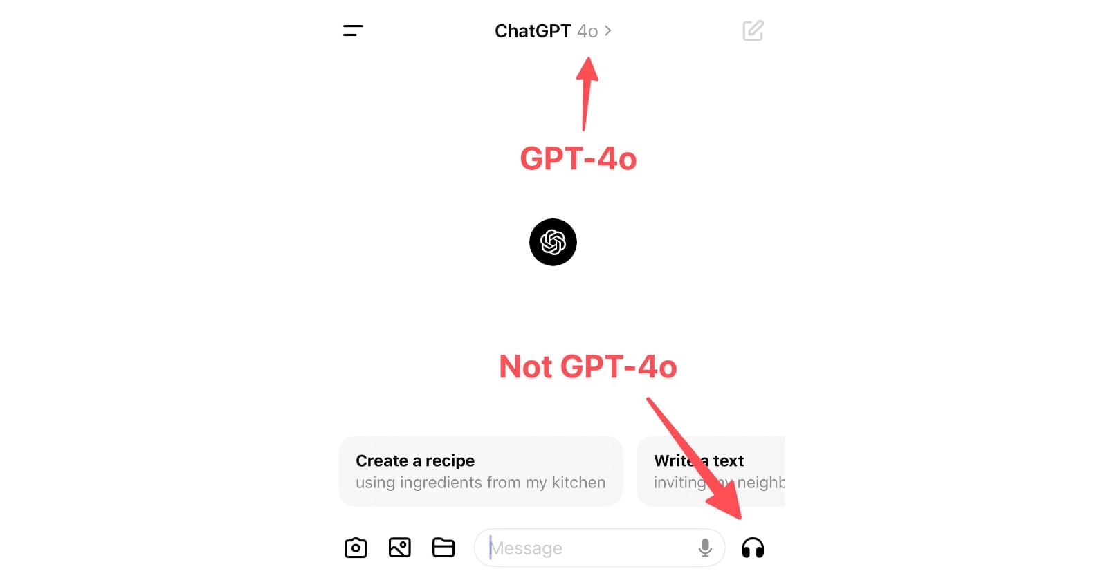
ChatGPT in “4o” mode is not running the new features yet
Monday’s OpenAI announcement of their new GPT-4o model included some intriguing new features:
[... 898 words]How do you accidentally run for President of Iceland? (via) Anna Andersen writes about a spectacular user interface design case-study from this year's Icelandic presidential election.
Running for President requires 1,500 endorsements. This year, those endorsements can be filed online through a government website.
The page for collecting endorsements originally had two sections - one for registering to collect endorsements, and another to submit your endorsement. The login link for the first came higher on the page, and at least 11 people ended up accidentally running for President!
A bad survey won’t tell you it’s bad. It’s actually really hard to find out that a bad survey is bad — or to tell whether you have written a good or bad set of questions. Bad code will have bugs. A bad interface design will fail a usability test. It’s possible to tell whether you are having a bad user interview right away. Feedback from a bad survey can only come in the form of a second source of information contradicting your analysis of the survey results.
Most seductively, surveys yield responses that are easy to count and counting things feels so certain and objective and truthful.
Even if you are counting lies.
The language issues are indicative of the bigger problem facing the AI Pin, ChatGPT, and frankly, every other AI product out there: you can’t see how it works, so it’s impossible to figure out how to use it. [...] our phones are constant feedback machines — colored buttons telling us what to tap, instant activity every time we touch or pinch or scroll. You can see your options and what happens when you pick one. With AI, you don’t get any of that. Using the AI Pin feels like wishing on a star: you just close your eyes and hope for the best. Most of the time, nothing happens.
The Eight Golden Rules of Interface Design (via) By HCI researcher Ben Shneiderman. I particularly like number 4, “Design dialogs to yield closure”, which encourages feedback at the completion of a group of actions that “gives users the satisfaction of accomplishment, a sense of relief.”
2023
The 6 Types of Conversations with Generative AI. I’ve hoping to see more user research on how users interact with LLMs for a while. Here’s a study from Nielsen Norman Group, who conducted a 2-week diary study involving 18 participants, then interviewed 14 of them.
They identified six categories of conversation, and made some resulting design recommendations.
A key observation is that “search style” queries (just a few keywords) often indicate users who are new to LLMs, and should be identified as a sign that the user needs more inline education on how to best harness the tool.
Suggested follow-up prompts are valuable for most of the types of conversation identified.
Why Chatbots Are Not the Future. Amelia Wattenberger makes a convincing argument for why chatbots are a terrible interface for LLMs. “Good tools make it clear how they should be used. And more importantly, how they should not be used.”
2013
Do you need the feature in Dropbox mobile app that allows using the chosen files in offline mode? Why?
I use this all the time. It’s especially useful for travelling (when you’re abroad you often don’t have inexpensive cellular data or access to WiFi). I use it for:
[... 117 words]How can I produce an animated prototype out of designs for an iOS app?
Keynote is a surprisingly good tool for this kind of things, especially since they added path based animations to it a few years ago.
[... 55 words]How long should I budget for an experienced designer to design a responsive ecommerce store?
There’s no single answer to this—it depends on the scope of the project. A one-page store selling 3 items is quicker to design than a thousand page store with dozens of category homepages etc.
[... 87 words]What are the best web design and web development conferences/ meetups in Central & Eastern Europe (2013)?
We have a list of Web Design conferences and events in Central and Eastern Europe on Lanyrd—you might find our full list of Conferences in Central and Eastern Europe useful as well.
[... 94 words]What would be the best design conference to attend in 2013?
That’s a pretty tricky question to answer... there are a lot of excellent UX conferences around (we’re listing 69 upcoming UX events on Lanyrd at the moment, and more get added frequently). A few things you should consider:
[... 198 words]2012
What are some good ways to insult an Information Architect?
Ask them if they’ve started calling themselves a UX designer yet, or if they’ve jumped straight to Service Design :)
[... 36 words]Are there any good examples of ’large amounts of information being displayed simply and intuitively?’
Much of Edward Tufte’s career has been dedicated to documenting (and inventing) ways of handling these problems—his books are an absolute joy to browse through: http://www.edwardtufte.com/tufte/
[... 75 words]How do you make an existing web application more mobile-friendly without rebuilding it?
Learn about responsive web design. Provided your site is built reasonably well using CSS for layout there is a TON of stuff you can do with CSS media queries to make your site work better on small screen devices. For example, using media queries to detect small screen (mobile) devices you can...
[... 147 words]Which sites do a good job of guiding first time users?
The Twitter sign up process is fascinating, and constantly evolves. I create a new Twitter account every six months or so just to see what their latest iteration looks like.
[... 157 words]What activities, games or examples have you used to persuade developers that they are different from ’real’ users?
I doubt there’s anything as effective as getting them to watch a well-run usability test—either a video, a fancy one-way glass setup or just having them quietly observe a zero-budget testing session in a coffee shop.
[... 62 words]Why does Facebook Comments Box only support two levels of hierarchy?
I’ve heard in the past that regular (i.e. non-geek) users often have enormous trouble understanding hierarchical comments—they don’t understand tree based file systems either.
[... 65 words]2011
What is the “best” programming language to learn if you want to mockup your own ideas but don’t have a technical background?
I knew a very talented UX designer at Yahoo! who did all of his interactive mockups in PowerPoint—including widgets that you click to transition to another “page” in the interface. I’ve heard of people doing the same thing in Keynote, and OmniGraffle Pro also has tools for creating interactive mockups.
[... 111 words]What are some good user interface/user experience workshops/conferences coming up this March(p.s. distance isn’t a factor, I’m willingly to travel)?
We have a list on http://lanyrd.com/topics/user-ex...—the best option in March looks to be Adaptive Path’s MX conference: http://lanyrd.com/2011/mx/ / http://mxconference.com/
[... 51 words]What are the best free resources to begin learning UX design?
We’re collecting videos and slides from conference sessions covering user experience on Lanyrd—here’s 10 videos and 14 slide decks:
[... 42 words]2010
What UX/UI conferences in the SF Bay area are worth attending?
BayCHI is excellent from what I’ve heard: http://www.baychi.org/
[... 50 words]To what extent is it still valid to assume that your web app users are stupid?
They’re not stupid, but they’re probably WAY less web literate than you might expect—unlike you, they haven’t spent their entire career learning how the web works. See the famous “What is a browser?” video the Google Chrome team released:
[... 71 words]Why doesn’t Facebook use nicer URLs?
Just noticed this link: http://www.facebook.com/notes/fa...—so it looks like things are beginning to improve.
[... 28 words]Dark Patterns: Forced Continuity example, Audible.com. Dark Patterns are user interfaces that are designed to trick people. I just submitted Audible.com for their habit of signing up users for a $7.49 “gold membership” without making it clear on the checkout screens that this is a recurring monthly charge, not a one-off payment.
